

Picture a ceramics workshop in La Bisbal d’Empordà that sells mugs, bowls and plates through its online shop. Each product has a photo on a white background, the name of the model and two lines: “Handmade stoneware mug. Dishwasher safe.” The same questions keep arriving on WhatsApp: how much it holds, whether every piece comes out the same colour, how much it costs to send one to Madrid. Each of those questions is a detail missing from the product page. People who write in still want to buy. People who can’t be bothered to write go to another shop.

What a product page is
A product page is the page for each item in an online shop: the photos, the name, the price, the variants, the buy button and everything people need to know before paying. It does the job of the shop counter, with one difference: nobody can pick up the mug, turn it over or ask the person serving. What a physical shop sorts out with a look and a question, the page has to sort out online.
A page that sells answers four things: what exactly the product is, whether it suits the person looking, how much it will cost in total and when it will arrive. If one is missing, the sale stalls halfway. Google, for its part, separates pages where you can buy a product, which it calls merchant listings, from pages that only describe it, such as a review. The first kind can carry more data, such as shipping details or the return policy.
What has to show before anyone scrolls
On a phone screen, before anyone moves a finger, five things need to fit:
- A name that says what it is. “Glazed stoneware mug, 350 ml” says more than “Model Mar”. The model name can come after.
- The final price. If you sell to consumers in Spain, with VAT included: consumer law requires the offer to show the full final price, taxes included.
- The main photo, large and sharp, showing the whole product.
- The variants, such as colour or size, with the price of each one and whether it is in stock.
- The buy button and, close to it, the delivery time and the shipping cost.
Everything else can go further down: the full description, the measurements, care instructions and reviews. People who already know what they want buy from the top, and people who are unsure scroll down to read.
Product photos: what people cannot touch
A photo on a white background shows the product but answers very few questions. For a mug you would need at least these product photos:
- from the front and from the side, with the handle in view;
- a close-up of the glaze in natural light;
- in a hand or next to something familiar, so the size is clear;
- in use, with coffee, on the breakfast table;
- the base with the workshop stamp and, if it is meant as a gift, the packaging.
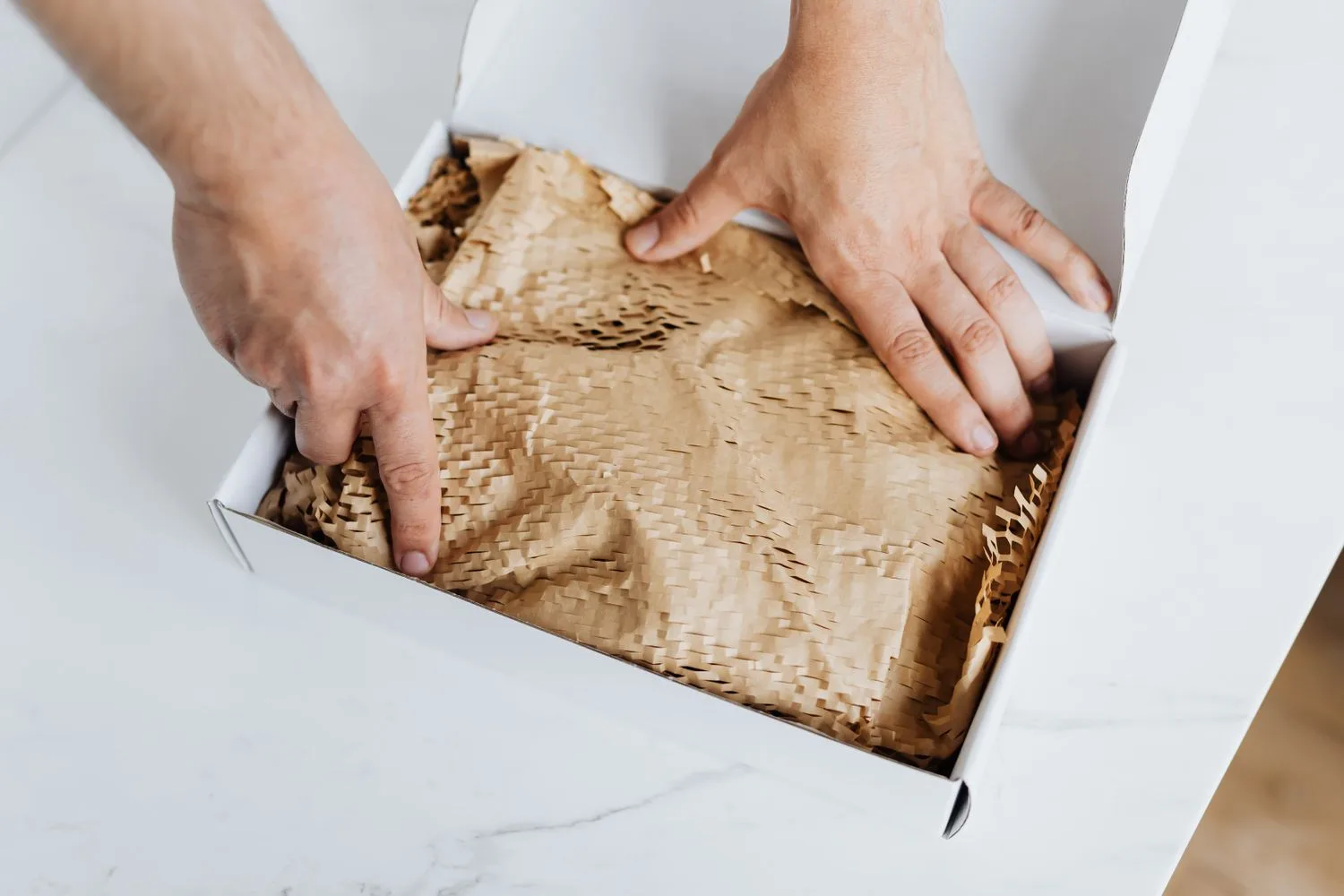
If every piece comes out different, say so on the page and show two or three examples so people can see how much they vary. That way nobody gets a surprise when they open the box.
One detail almost nobody looks after is the file name and the alt text. In its image SEO guide, Google gives the example that “my-new-black-kitten.jpg” is a better name than “IMG00023.JPG”, and says alt text is the most important attribute for giving information about an image, as long as you don’t stuff it with keywords. How to prepare photos with a phone, and keep them light, is in photos for your website.

How to write the description on a product page
The temptation is to copy the supplier’s text. It is quick, but every shop selling the same item has that paragraph, so it doesn’t set you apart from any of them, and it rarely answers what your customers ask. If you make the product yourself, it doesn’t even exist: someone has to write it.
Put the questions people ask on the product page
The best list of what a page should say is in your WhatsApp and your inbox. For a month, write down the questions people ask about each product and answer them in writing on the page itself: capacity, measurements, weight, material, whether it goes in the dishwasher or the microwave, how to care for it and what comes in the box. If three people have asked the same thing, the page doesn’t explain it well enough.
Use the words your customers use
You say “glazed stoneware mug” and people search for “large ceramic mug” or “handmade mug gift”. Use both. In Search Console, the Performance report shows which searches each page appears for; if a search that brings you impressions isn’t in the text, add it where it fits.
Essentials first, details after
Two or three sentences at the top saying what it is and who it is for, and below them the details in a list or a short table, easy to scan. A good product description doesn’t need to be long; it needs to answer. For a mug, one or two hundred well-chosen words are enough; a technical or expensive product will need more.
Want to know what it would cost you?
We reply the same day. No commitment, no sales pitch.
Price, shipping and returns on the page, not at the end
This is what loses the most sales. The Baymard Institute, which researches online shop usability, puts abandoned carts at about seven in ten: 70.22%, the average across 50 studies. In its survey of US online shoppers, leaving aside people who were just browsing, 40% abandoned because extra costs such as shipping, taxes or fees were too high. Another 13% gave up because the return policy didn’t convince them, and 12% because they couldn’t see or work out the total order cost up front.
The law asks for it too. Spain’s General Law for the Defence of Consumers and Users (in Spanish) requires shops to state, before a distance sale, the total price with taxes and the shipping costs. Online shops must also say, at the latest when the purchase process starts, whether there are delivery restrictions and which payment methods they accept. And the period to withdraw from a distance purchase is, as a general rule, 14 calendar days from when the product is received. This is not legal advice: check your own case with your adviser.
In practice, the mug page could say something like this, near the button: “Shipping to mainland Spain €4.90, free over €60. Ships within 48 hours and arrives in two or three working days. You have 14 days to return it.” Three lines, three questions answered. It is also worth showing the payment methods before people reach the checkout; how to choose them is in payment gateway.
Sizes, colours and other variants
If the same mug comes in four colours, the usual approach is a single page with a selector, not four nearly identical pages competing with each other on Google. Picking a colour should change the photo, the price if it differs, and the stock status. Google accepts product variant structured data to understand that they are versions of the same product, and if two addresses in your shop show the same thing, the canonical tag tells it which one is the main one; we explain it in keyword cannibalization.
Reviews from people who already bought it
A review from someone who already has the mug at home answers questions you can’t answer as well yourself, such as whether it keeps coffee hot or whether it arrived well packed. Ask for it a few days after delivery, with a direct link to the page, and reply to the bad ones too. With product structured data, ratings can appear in Google results. Never invent them or copy them from another site.
Your product page on Google and in AI answers
For a page to do well on Google, the same things count as on any other page: a title with the name people search for, a meta description that gives a reason to click, such as the price or the delivery time, and a short, readable address. In a shop, product structured data also matters a lot. In its introduction to product structured data, Google explains that it lets your product information appear in fuller form in Search, including Google Images and Google Lens, with the price, availability, ratings or shipping. You can give Google that data by marking up your pages, with a Google Merchant Center feed and free listings turned on, or both. How the markup works, without the jargon, is in structured data.
For AI Overviews and AI Mode, Google’s guide to AI features asks for nothing special: the usual SEO practices apply. It does list three points that matter more than usual in a shop:
- Important content in text. Measurements that only appear written in a photo don’t count as text on the page.
- Structured data that matches what people see. If the page says €24 and the code says €22, something is wrong.
- Merchant Center and Business Profile information kept up to date, if you use them.
ChatGPT and other assistants work the same way: they can only recommend what they understand. A page that explains what the product is, who it is for, what it costs and when it arrives gives them far more to work with than two lines copied from the supplier. Some people already ask an AI “where can I buy this?” before they ask Google; getting your shop into that answer is the job of our GEO service.
The product page mistakes we see most
- The supplier’s text, word for word. The same as in every other shop selling the item, and it doesn’t answer what your customers ask.
- A single photo, or photos of several megabytes that load slowly on a phone.
- Shipping costs revealed at the last step. In Baymard’s data, that is exactly the surprise that loses the most sales.
- Deleting the page when the product sells out. If it is coming back, keep the page with an “out of stock” notice and an option to be told when it returns. If it isn’t, redirect it to a similar product so people arriving from Google don’t land on a 404 error.
- A buy button people have to look for. On a phone it should be visible without scrolling and say what it does: “Add to basket”.
Where to start: three pages this week
There is no need to redo the whole catalogue at once. Pick the three pages with the most visits, or the ones for your best-selling products, and go through them with these questions:
- Does the name say what it is?
- Are there at least five photos, one of them showing the product in use?
- Does it answer what people ask you on WhatsApp?
- Can you see the final price, shipping and delivery time without scrolling?
- Does it say how returns work?
Before changing anything, note how many visits and sales each one has. Change all three, give it a few weeks and compare the same number of days. If they improve, you know where to go next with the rest of the catalogue.
What it costs to have us do it
When we build an online shop, the catalogue is part of the conversation from day one: who takes the photos, who writes the product pages and what it costs if we upload them. It is priced per project, with a fixed quote in writing, and depends on the size of the catalogue, shipping, and whether it needs to connect to your stock or invoicing, which is custom software work. The numbers are in how much an online shop costs.
If you already have a shop and want your product pages to do better on Google, reviewing them is part of our SEO service, also with a fixed quote after a first no-obligation chat. The monthly fees on our prices page, from €100 to €1,500 a month plus VAT with no minimum term, cover websites and online presence; a shop is quoted separately.
We'll tell you in a ten-minute conversation
We reply the same day. No commitment, no sales pitch.
Send us the link to one of your product pages and we will tell you what it is missing. You can also write to us through the contact form.
Tell us what you need and we'll give you a price
We reply the same day. No commitment, no sales pitch.